The Market Data Analysis Software
Introducing XLERATE
Sarus XLerate is a powerful, easy to use Excel add-in that provides a comprehensive end-of-day market data solution for your trading and analytic needs. XLerate integrates seamlessly into Microsoft Excel, enabling you to create amazing market data reports with just a few mouse clicks - and from virtually anywhere, 24/7.
There are no cryptic exchange symbols to remember and creating detailed market data charts that allow zoom and scroll can be done with a single click. Controlling the charts is easy using point and click and the XLerate built in dialogs.
There are over 40 built-in analytic 'Quick functions' that can be added to any data column for more detailed analysis. Create reports in any frequency - day to year (including custom weeks, half months and months). Choose date ranges, fill type, lead/lag, weekend handling and more.
XLerate gives users unprecedented functionality and control and is suited to front, mid or back office roles where it can be used with ease by traders, analysts, data scientists and office staff.
If you can use Excel, you can use XLerate.
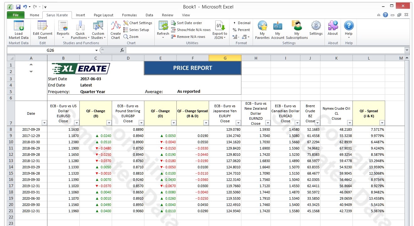
A quarterly average TS report showing market data and three quick function
columns.
Use the arrow buttons to scroll or double click to view the image.
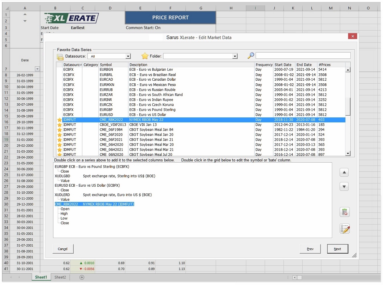
Easy "Point and Click" data selection with intuitive, easy to use
dialogs.
Use the arrow buttons to scroll or double click to view the image.
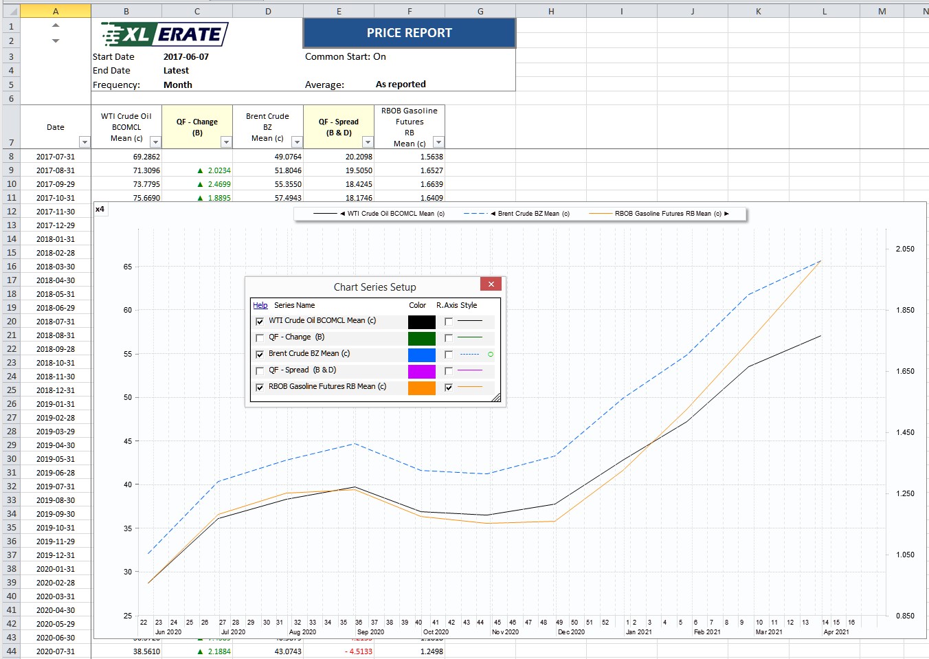
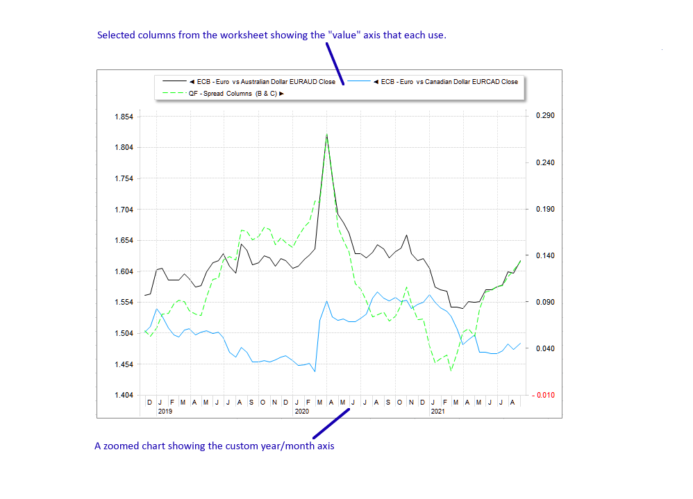
A chart series editor dialog on a x4 zoomed report chart. Each line
can have its visibility, type, color, axis and style configured.

A two panel report chart showing the underlying chart data and a two panel
chart.
Use the arrow buttons to scroll or double click to view the image.
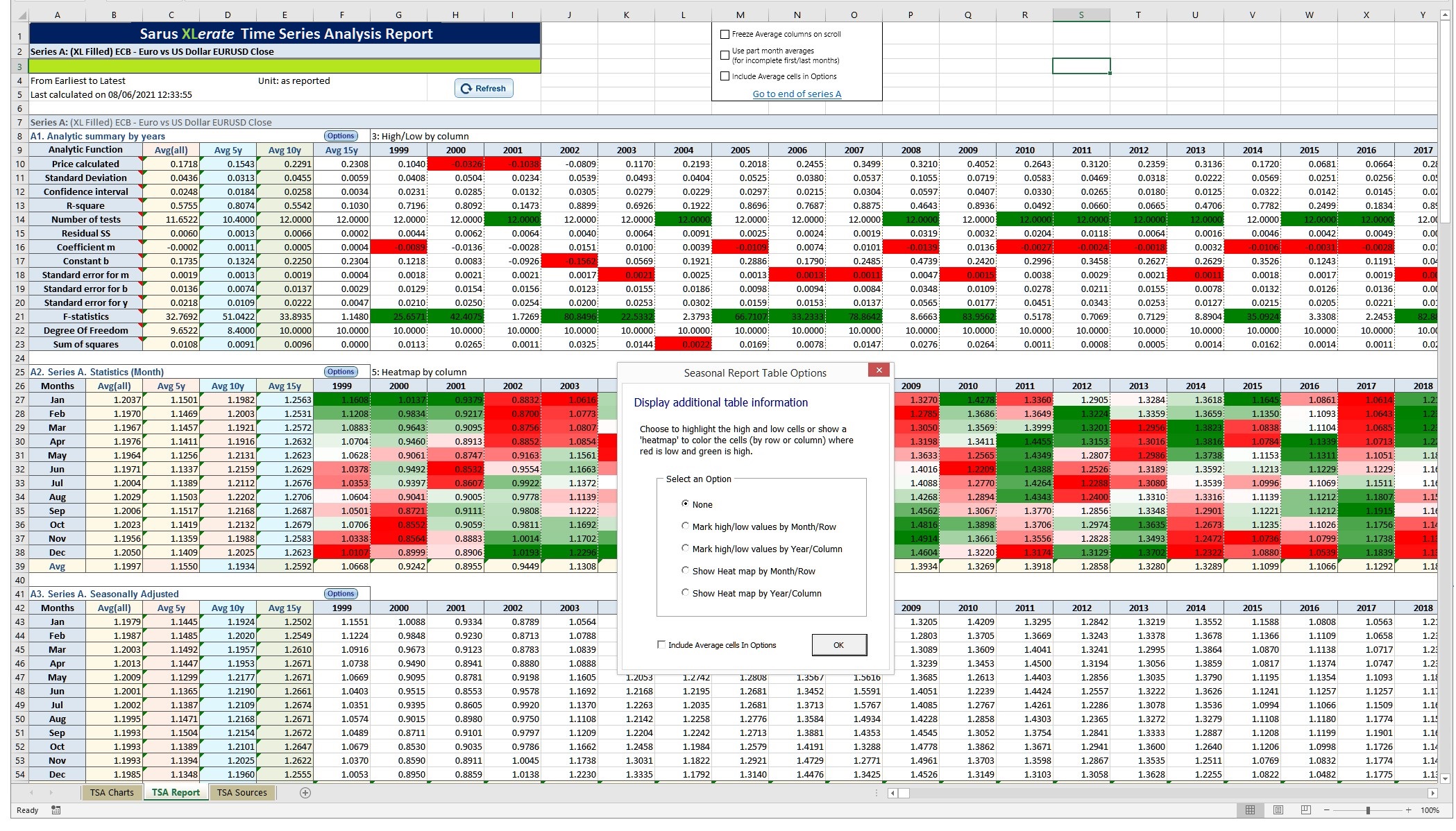
A Time Series Analysis report showing heatmaps and the selected panel
properties
dialog.
Use the arrow buttons to scroll or double click to view the image.
There are thousands of reference data time series are available from stock and commodity exchanges, banks, proprietary market data providers, independent pricing agencies as well as global currencies, cryptocurrencies, world indices and more. We can also connect to your other market data services and even integrate your own proprietary data into the service.
Reports
XLerate has three main report types:
Time Series
Select, display and chart any datasets in standard Excel column format.
Analytic
Predefined interactive reports to help you quickly analyse and compare datasets.
Snapshot
Build quote style pages showing a snapshot of any market on a particular date.
All reports are saved as Excel workbooks to make sharing and updating by colleagues easy. Each report type is explained in more detail in the sections below.
Time Series Reports
Time Series reports contain columns of market data. The date column is always column ‘A’ with value columns are to its right containing time series datasets as well as optional Quick Function columns (QF's). The market data can be in virtually any frequency or date range and QF's can be quickly added with just a few mouse clicks.
A half-monthly average TS report showing market data columns, a quick
function column and a chart.
Use the arrow buttons to scroll or double click to view the image.
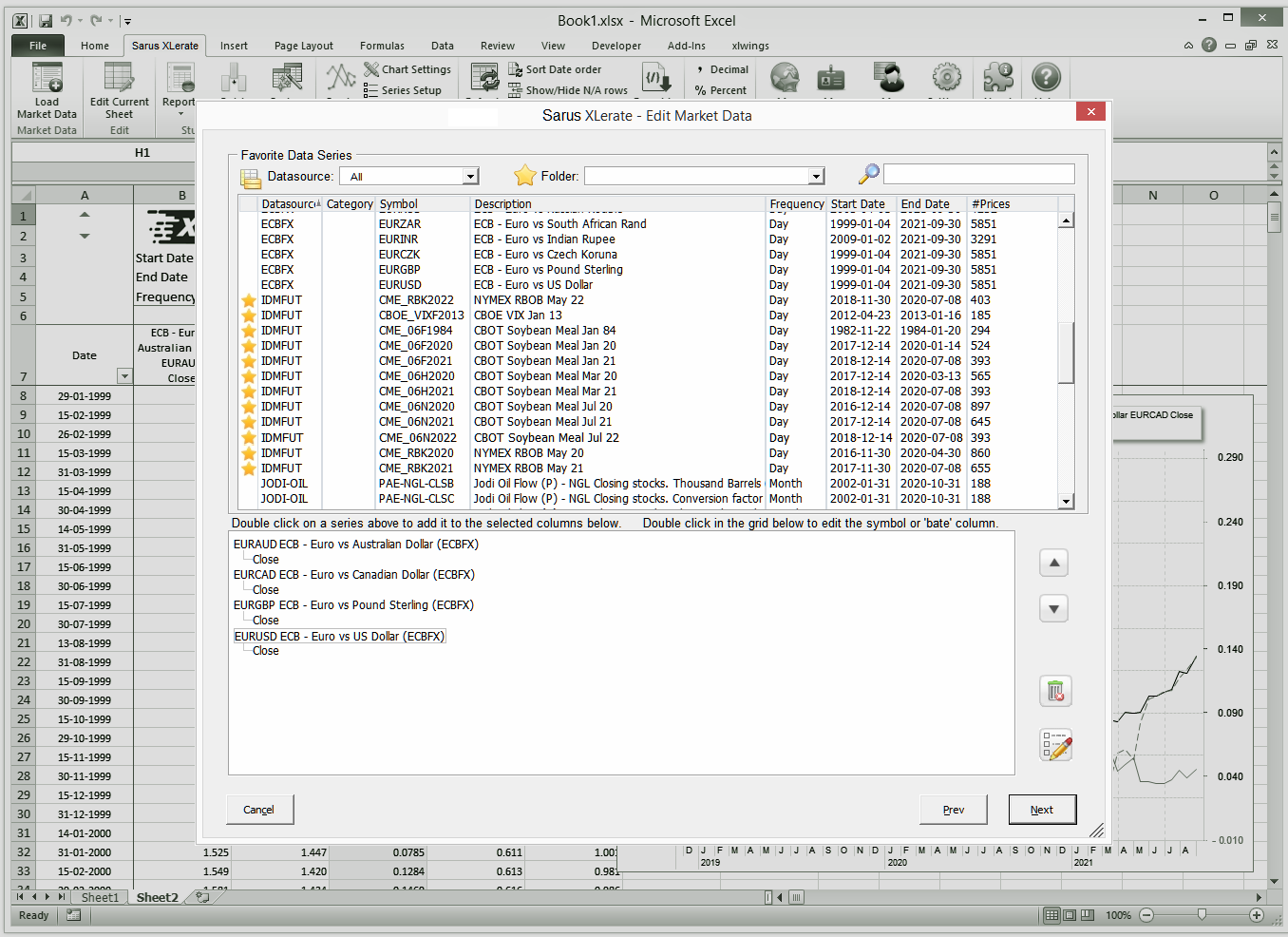
Selecting the report market data columns with the easy to use XLerate
point
and click interface.
Use the arrow buttons to scroll or double click to view the image.
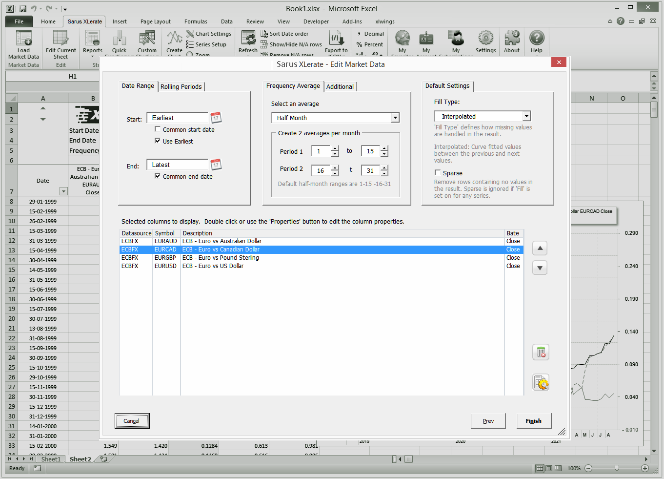
Selecting the range, frequency, sparse and fill settings to use.
Use the arrow buttons to scroll or double click to view the image.
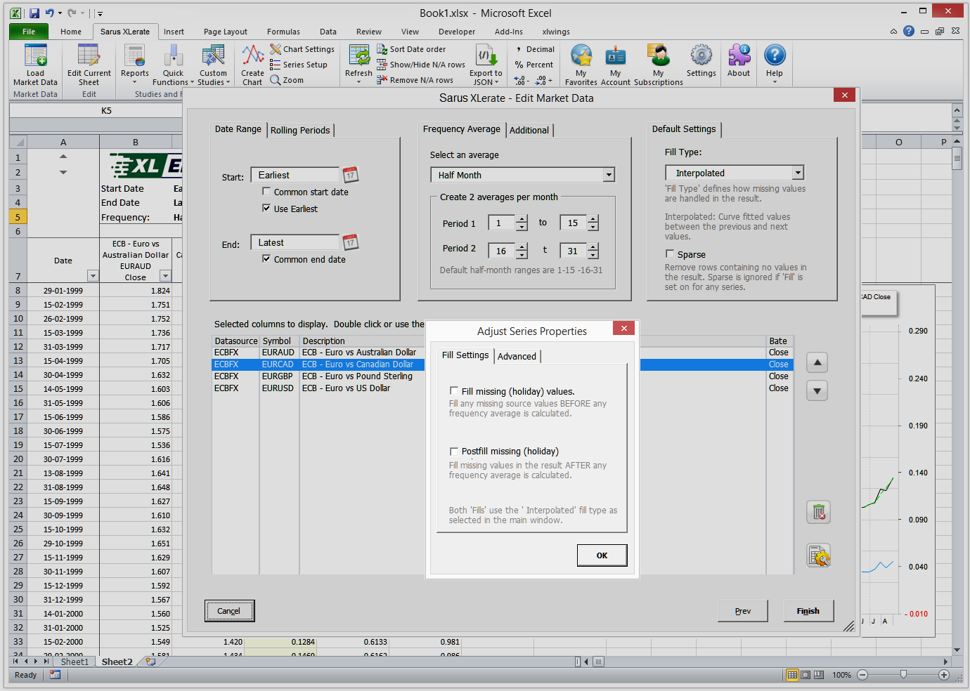
Choose the fill and post fill options. Use the "Advanced tab to set how
weekends are handled and any lead/lag to use.
Use the arrow buttons to scroll or double click to view the image.
A close up of a small standard chart. Use the XLerate dialogs to edit
both
the charts and chart lines. Charts can be resized, zoomed and
scrolled.
Use the arrow buttons to scroll or double click to view the image.
Like all XLerate reports, Time Series reports can be refreshed, edited and shared. Their market data can be automatically exported to JSON files for easy inclusion into Business Intelligence systems like SaS™, Tableau™ and Microsoft Bi™.
For developers, market data can also be received directly via HTTP from the Monitor+ market data API. Sarus XLerate itself was written using the Monitor+ API to present and return all market data.
Time Series Reports can be further enhanced with drop-in Quick Functions (QF's). There are over 40 analytic QF's available and each can be added with just a few mouse clicks from the built in menus. See the "Quick Function" section below for more details.
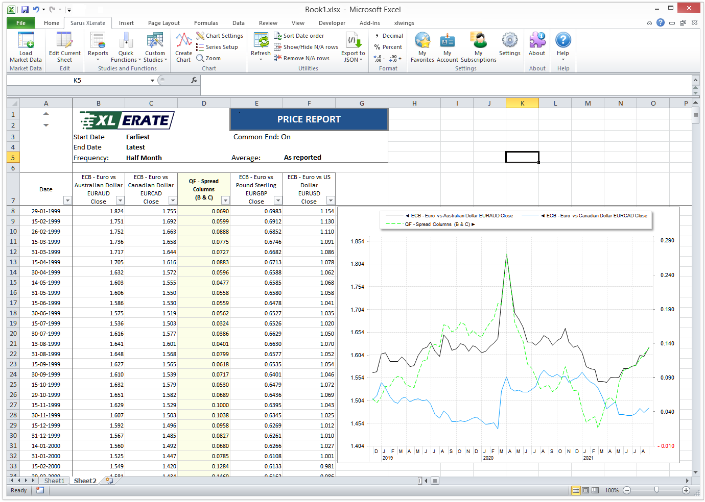
Time Series Charts
XLerate has beautifully detailed charts that can be resized, zoomed and scrolled along the date axis. You can plot any worksheet data series along the left or right value axis allowing worksheet series with no obvious price relationship to be overlaid along same date axis.
A simple zoomed time series chart.
Use arrow buttons to scroll. Double
click to view.
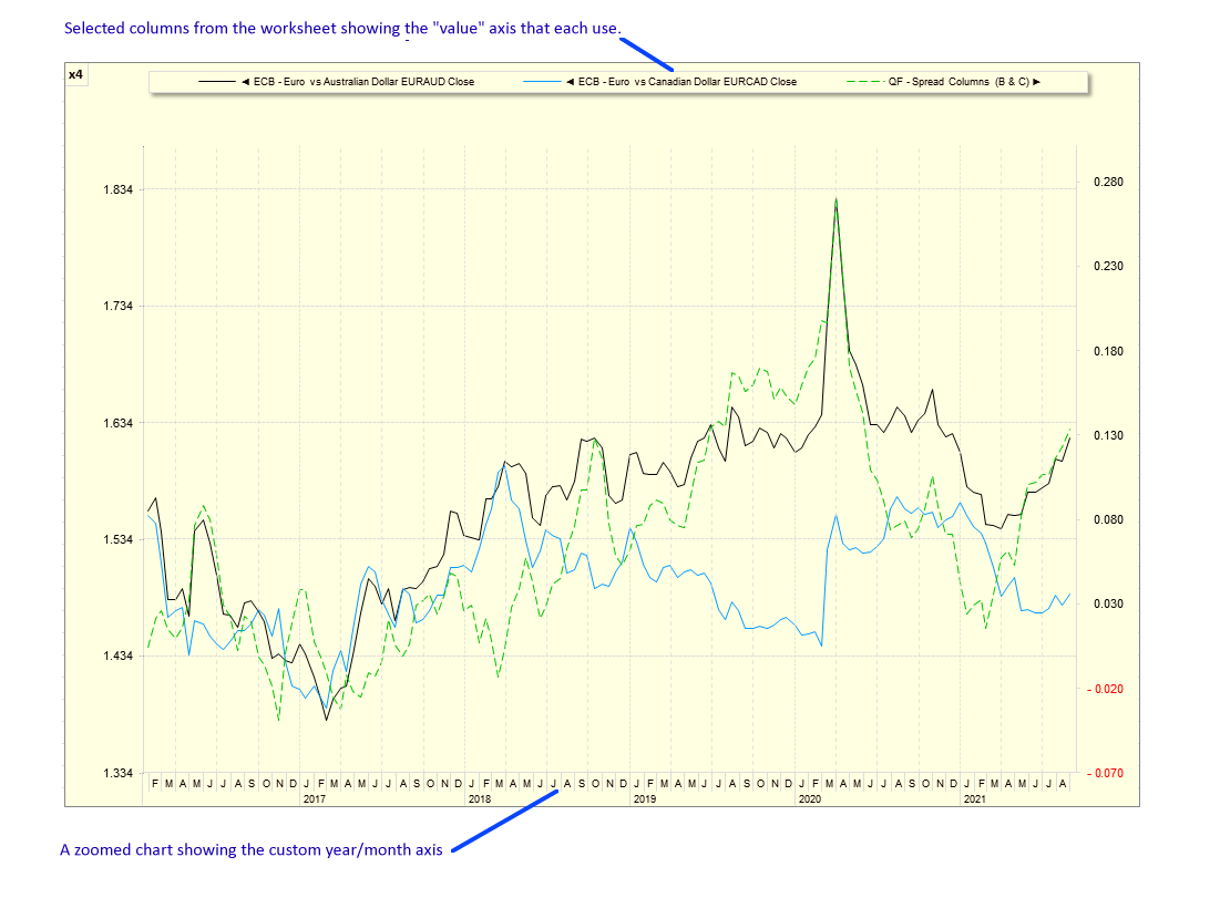
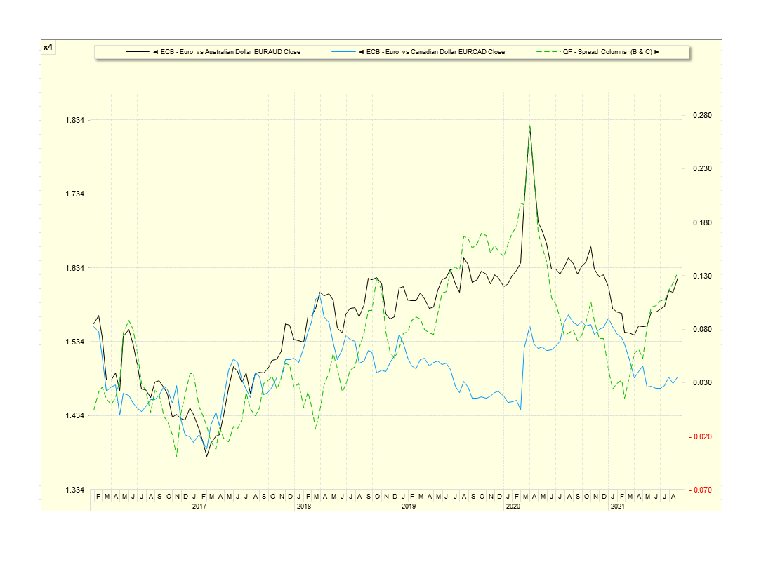
A simple zoomed time series chart legend axis arrows and custom date
axis.
Use arrow buttons to scroll. Double click to view.
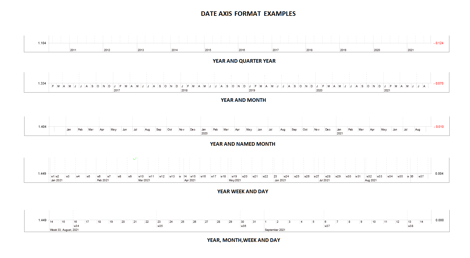
Charts automatically adjust the date axis to suit the visible range.
Above are some date axis showing financial date formats.
Use arrow
buttons to scroll. Double click to view.
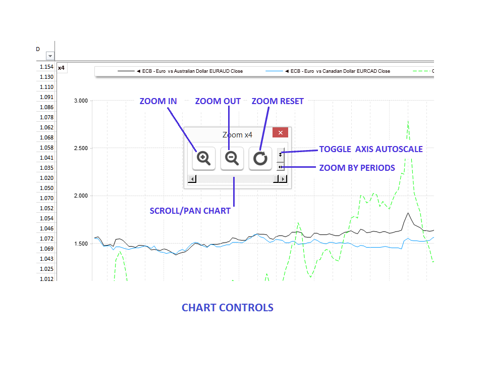
Each chart can be zoomed and controlled from a single dialog.
Use
arrow buttons to scroll. Double click to view.
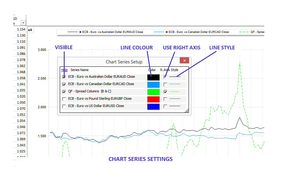
Every chart series can have their settings (visibility, colour, type and
axis) changed from a single dialog.
Use arrow buttons to scroll.
Double click to view.
Charts and plots can be edited with the built in XLerate dialogs and can be split allowing four price axis per chart. The chart date axis was designed for market data analysis and aligns on week, month and year boundaries.
Analytic Reports
XLerate has a number of built in interactive analytic reports and studies to help you quickly analyse time series datasets. They include Time Series Analysis, Correlation Matrix, FX, Seasonality, ANOVA and MACD. Each report contains three worksheets source, chart and report.
Analytic report charts can also be edited, scrolled and zoomed and choose which dataset columns to display in the chart. Many charts can display a data panel showing the chart values (see the top of the image below).
Analytic report charts can also be edited, scrolled and zoomed. You can choose which dataset columns to display in each. Many charts can display a data panel showing the chart values (see the top of the image below).
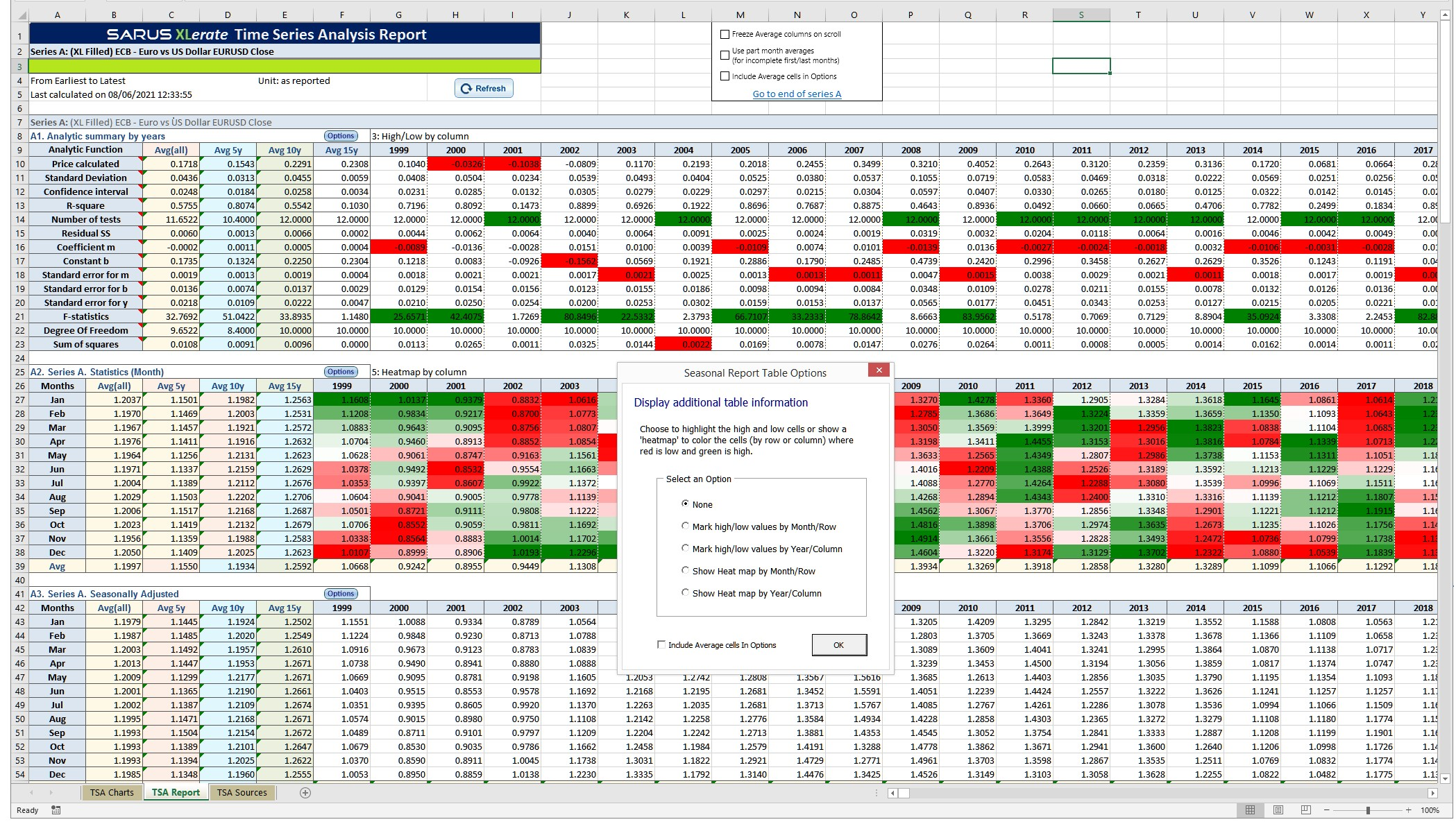
Sample Time Series Analysis report showing the section heat map
dialog.
Use arrow buttons to scroll. Double click to view..
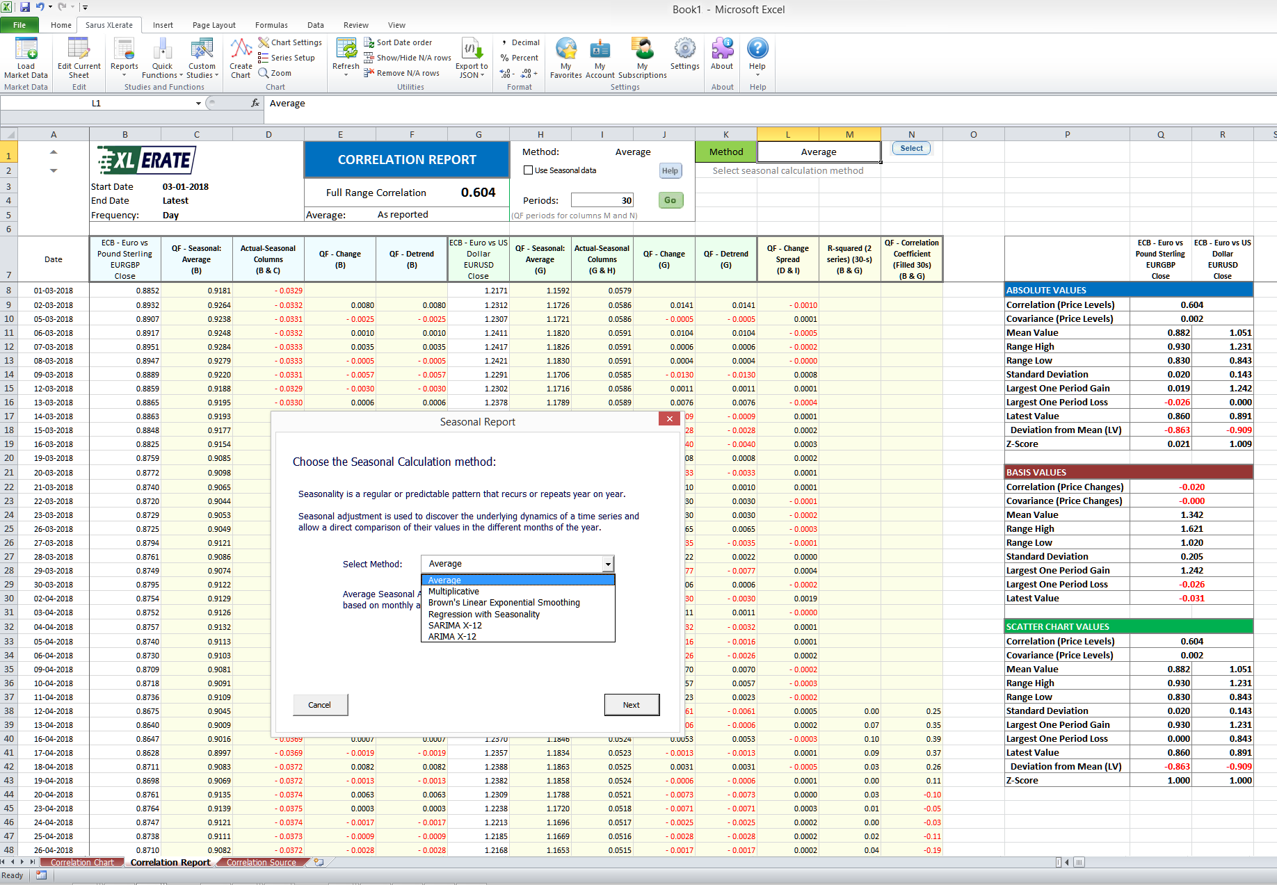
Sample Correlation report showing the Report Calculation Type
dialog.
Use
arrow buttons to scroll. Double click to view.
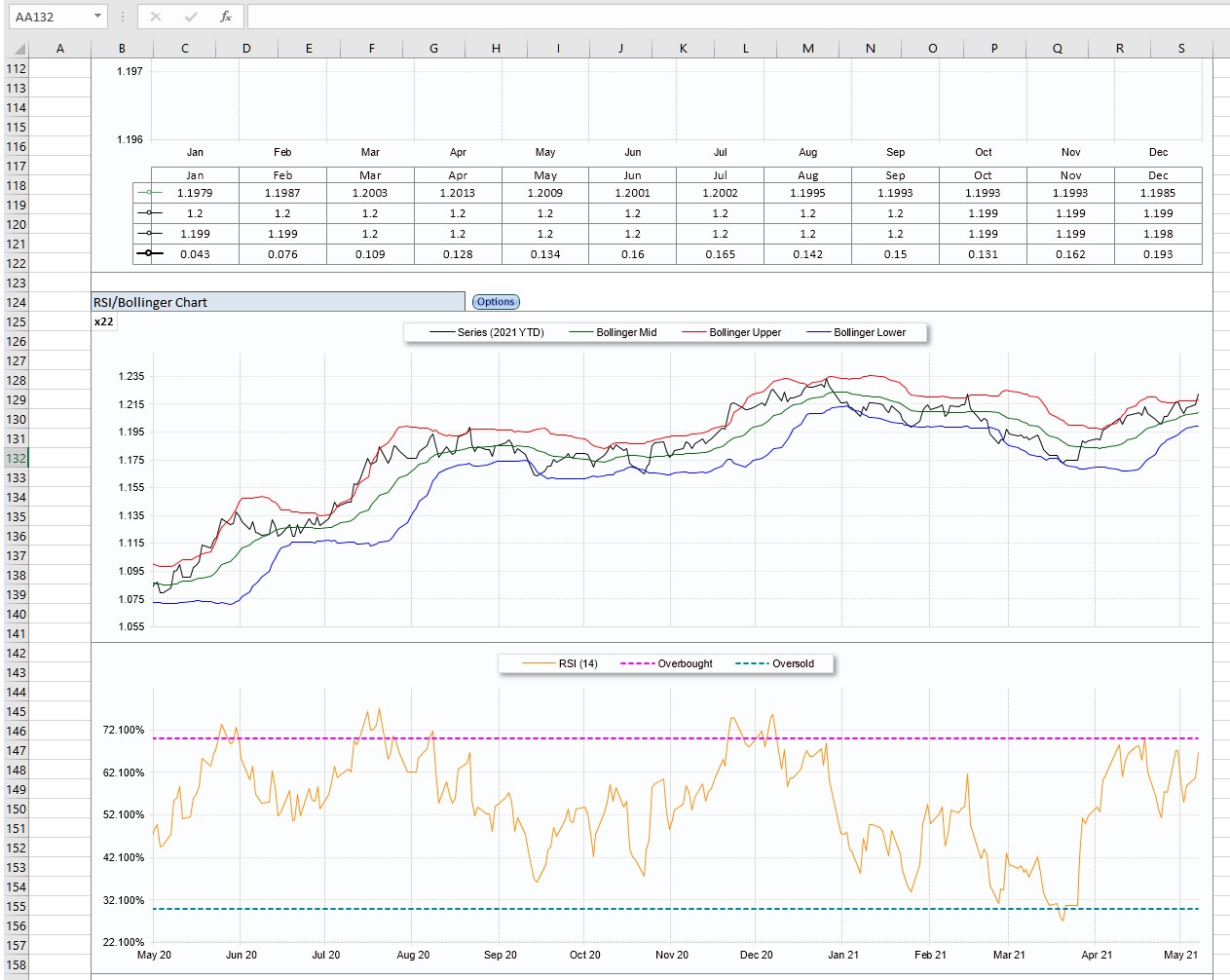
Sample two panel RSI/Bollinger chart with data grid.
Use arrow buttons
to
scroll. Double click to view.
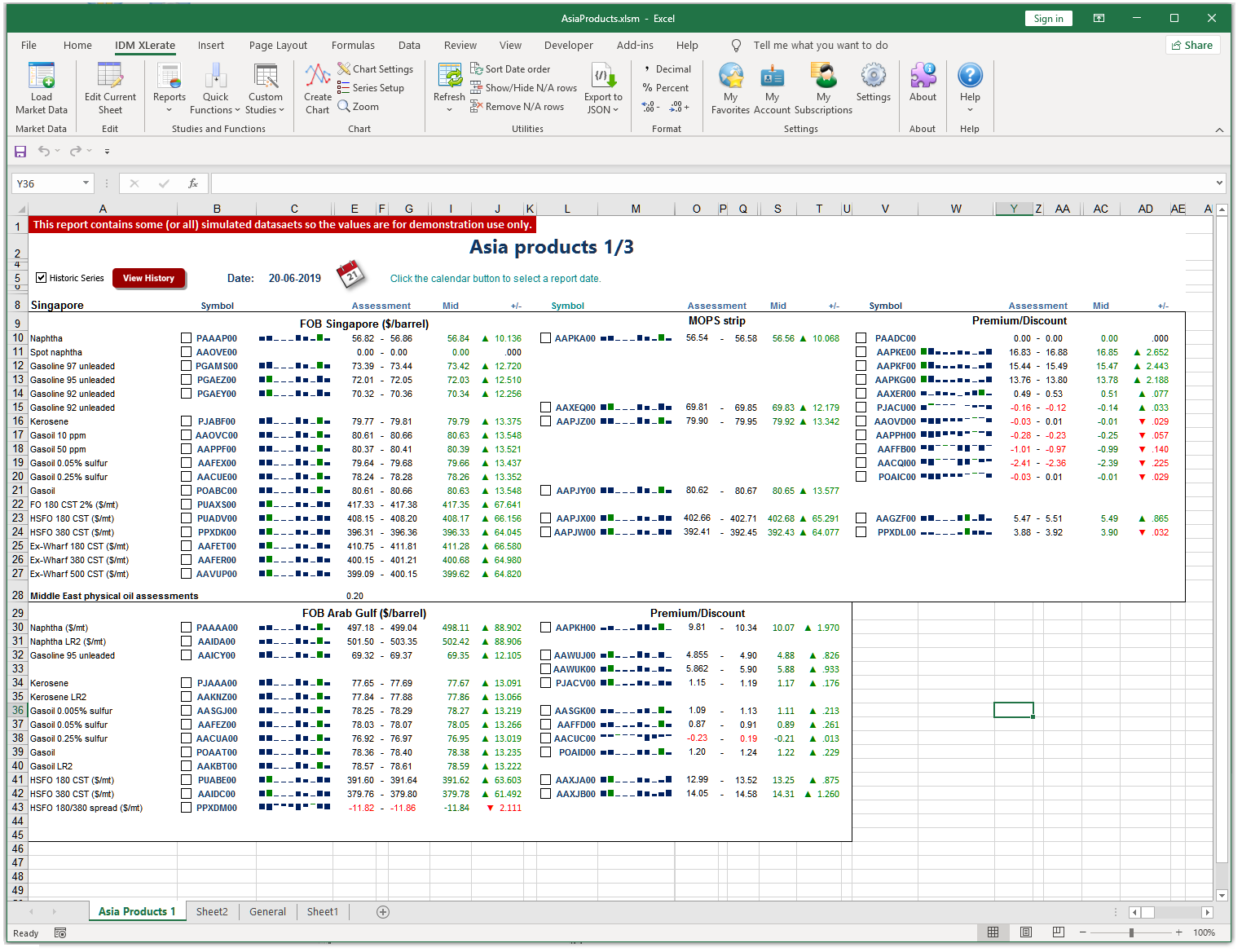
Snapshot Reports
Snapshot reports allow you to build your own quote pages containing a number of contracts from different datasources. The reports can contain average results as well as "Change" and "Sparkline" data. The contracts for the report are stored in a 'source' worksheet with the API result data and optional sparkline values. You then create the display worksheet and reference the source sheet value cells.
In the sample report below, we show sample sparklines and have added the option to allow the user to select contracts (using checkboxes) and to create a historical report using the selected contracts. We provide sample code and a clear explanation on how to create your own.
As well as charging for proprietary data, many data vendors have additional fees for their own published reports. If you subscribe to the vendors reports and their data service, it may be possible to reduce your costs by recreating (and customizing) your own version the vendors report tables using snapshot reports.
Snapshot reports are always up to date with any published corrections (at the time the report was last updated). They can be created for any date with the click of a button. We'll help you get started with sample VBA code and advice.
Quick Functions
XLerate has over 40 drop in 'Quick Functions' ('QF') that allow easy addition of analytic columns to XLerate worksheet columns. These analytic functions are activated directly from the Excel pop-up menu.
With the QF editor, select the source columns, click Ok and the QF is inserted in a column next to the source column. Best of all, QF's can be edited and update when the worksheet refreshes.
Some of the QF's that are available are:
Average (mean)
The average (mean) of values in two data columns. You can select the data columns, the number of periods to use in the average and if missing values in the data column should be filled using the previous value.
Average Gain
The average gain made for a defined number of periods in one data column. You can select the data column, the number of periods to use in the average and if missing values in the data column should be filled using the previous value.
Average Loss
The average loss made for a defined number of periods in one data column. You can select the data column, the number of periods to use in the average and if missing values in the data column should be filled using the previous value.
Bernoulli Random Walk
A random walk generated by Bernoulli trials. The example of a Bernoulli
random
walk may be used to explain certain basic features of more general random
walks.
In particular, even in this very simple scheme there appear properties of
"randomness" which are intuitively paradoxical.
 Read more on Wikipedia...
Change (on previous)
The change on the previous value. Can be displayed with colored arrows and text to highlight the change direction.
Confidence Interval
a confidence interval (CI) is a range of estimates for an unknown parameter,
defined as an interval with a lower bound and an upper bound
(notwithstanding
one-sided confidence intervals, which are bounded only on one side). The
interval is computed at a designated confidence level. The 95% confidence
level
is most common, but other levels (such as 90% or 99%) are sometimes used.
Read more on Wikipedia...
Correlation Coefficient
A correlation coefficient is a numerical measure of some type of correlation,
meaning a statistical relationship between two variables.[a] The variables
may
be two columns of a given data set of observations, often called a sample,
or
two components of a multivariate random variable with a known distribution.
Read more on Wikipedia...
Crack Spreads
Crack Spread is a term used on the oil industry and futures trading for the
differential between the price of crude oil and petroleum products extracted
from it. The spread approximates the profit margin that an oil refinery can
expect to make by "cracking" the long-chain hydrocarbons of crude oil into
useful shorter-chain petroleum products.
Read more on Wikipedia...
Detrend
A detrend involves removing the effects of trend from a data set to show only
the
differences in values from the trend; it allows cyclical and other patterns
to
be identified
Read more on Wikipedia...
Difference
Differencing in statistics is a transformation applied to a non-stationary
time-series in order to make it stationary in the mean sense (viz., to
remove
the non-constant trend), but having nothing to do with the non-stationarity
of
the variance or autocovariance.
Read more on Wikipedia...
Exponential Moving Average
Is a first-order infinite impulse response filter that applies weighting
factors
which decrease exponentially. The weighting for each older datum decreases
exponentially, never reaching zero. The graph at right shows an example of
the
weight decrease
Read more on Wikipedia...
Exponential Smoothing
Is a rule of thumb technique for smoothing time series data using the
exponential
window function. Whereas in the simple moving average the past observations
are
weighted equally, exponential functions are used to assign exponentially
decreasing weights over time
Read more on Wikipedia...
Gaussian Random Walk
Is a random walk having a step size that varies according to a normal
distribution is used as a model for real-world time series data such as
financial markets. The Black–Scholes formula for modelling option prices,
for
example, uses a Gaussian random walk as an underlying assumption.
Read more on Wikipedia...
Inverse
In Mathematics Inverse is a function that can reverse into another function. Inverse is often used in currencies to calculate the reversed rate of 2 currencies by changing the "from" and "to" currency. For example. if exchange rate of USD/GBP is 0.76 then the inverse would be exchange rate for GBP/USD (1/0.76) of 1.32.
Math Functions
Apply an add, subtract, multiply or divide to two columns or one column and a number. Useful for applying conversion factors or currency rates to a column
Momentum
Momentum is the rate of acceleration of a security's price—that is, the speed
at
which the price is changing. Market momentum refers to the aggregate rate of
acceleration for the broader market as a whole.
Read more on Investopedia...
Percent Change
A percentage change is a way to express a change in a variable. It represents
the
relative change between the old value and the new one
Read more on Wikipedia...
Rate of Change
The Price Rate of Change (ROC) is a momentum-based technical indicator that
measures the percentage change in price between the current price and the
price
a certain number of periods ago.
Read more on Investopedia...
Regression Linear
Linear regression is the analysis of two separate variables to define a
single
relationship and is a useful measure for technical and quantitative analysis
in
financial markets.
Read more on Investopedia...
RSI
The relative strength index (RSI) is a momentum indicator used in technical
analysis that measures the magnitude of recent price changes to evaluate
overbought or oversold conditions in the price of a stock or other asset.
Read more on Investopedia...
'R'-squared
In statistics, the coefficient of determination, denoted R2 or r2 and
pronounced
"R squared", is the proportion of the variation in the dependent variable
that
is predictable from the independent variable(s).
Read more on Wikipedia...
Seasonal Adjustment
Seasonal adjustment or deseasonalization is a statistical method for removing
the
seasonal component of a time series.
Read more on Wikipedia...
Seasonal Index
Seasonal variation is measured in terms of an index, called a seasonal index.
It
is an average that can be used to compare an actual observation relative to
what
it would be if there were no seasonal variation. Also known as a Seasonal
Relative and Seasonal Factor.
Read more on Wikipedia...
Simple Moving Average
In financial applications a simple moving average (SMA) is the unweighted
mean of
the previous user defined number of data-points.
Read more on Wikipedia...
Spread
In simple terms, a spread is the difference between 2 values. The
commodity-product spread is the difference between the price of a raw
material
commodity and the price of a finished product created from that commodity.
The
commodity-product spread forms the basis of some favourite trades in the
futures
market.
Read more on Wikipedia...
Standard Deviation
The standard deviation is a statistic that measures the dispersion of a
dataset
relative to its mean and is calculated as the square root of the variance.
The
standard deviation is calculated as the square root of variance by
determining
each data point's deviation relative to the mean.
Read more on Investopedia...
Weighted Moving Averages
A weighted average is an average that has multiplying factors to give
different
weights to data at different positions in the sample window. Mathematically,
the
weighted moving average is the convolution of the data with a fixed
weighting
function.
Read more on Wikipedia...
A YouTube video showing how easy it is to add two QF's to a worksheet.
And so much more...
XLerate can do so much more for your company and colleagues than can be described in these pages. With XLerate, your company can make significant savings on both software and market data costs while gaining an extremely powerful, easy to use analytic tool to help leverage greater value from your market data.
If you wish to power business information system (BIS) solutions, internal reports,integrate with 3rd party software or create your own market data databases then you should consider the Monitor+ API. The API is extremely powerful and provides the market data that you need. You can request market data in JSON format and works with virtually all programming languages. It has 'R' and Python packages for fast and easy native access. With just two lines of code, developers can be receiving the market data to create the solutions your company needs. Please refer to the Monitor+ API product page under the "Solutions" menu at the top of the page for more information.
If you subscribe to exchanges or vendors not listed here then please contact us to talk about adding them data to the Monitor+ service.
If your company would like a trial of XLerate, Monitor+ or have any questions then please contact us using the contact button above.
(c) 2000-2024 Sarus Systems Ltd. Sarus, Monitor+ and XLerate are trademarks of Sarus Systems Ltd. All trademarks acknowledged.